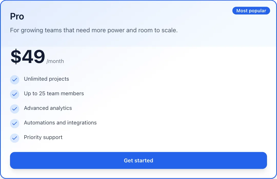
Pricing card
A single plan card that rises into view, ticks in its features and lifts on hover.
npm install motion clsx tailwind-merge lucide-react or npx programmable-cli add pricing-card
MP4 and GIF exports are for sites that are not on React. Each counts as this month’s download of the component.
What it’s for
- Your pricing page
- Plan pickers in onboarding
- Launch pages with an offer
How to use it
- Download the file. PricingCard.tsx is one self-contained React component. Pick a brand colour above and the file comes in it, where the component has a main colour to replace. Sites not on React can take it as an MP4 or GIF.
- Install what it uses.
npm install motion clsx tailwind-merge lucide-react, with Tailwind CSS set up in your project. - Drop it in.
import { PricingCard } from "./PricingCard";then render<PricingCard />where you want it.
Want it about your product? Make one like it and the studio builds a version with your features, numbers and brand.
Related components
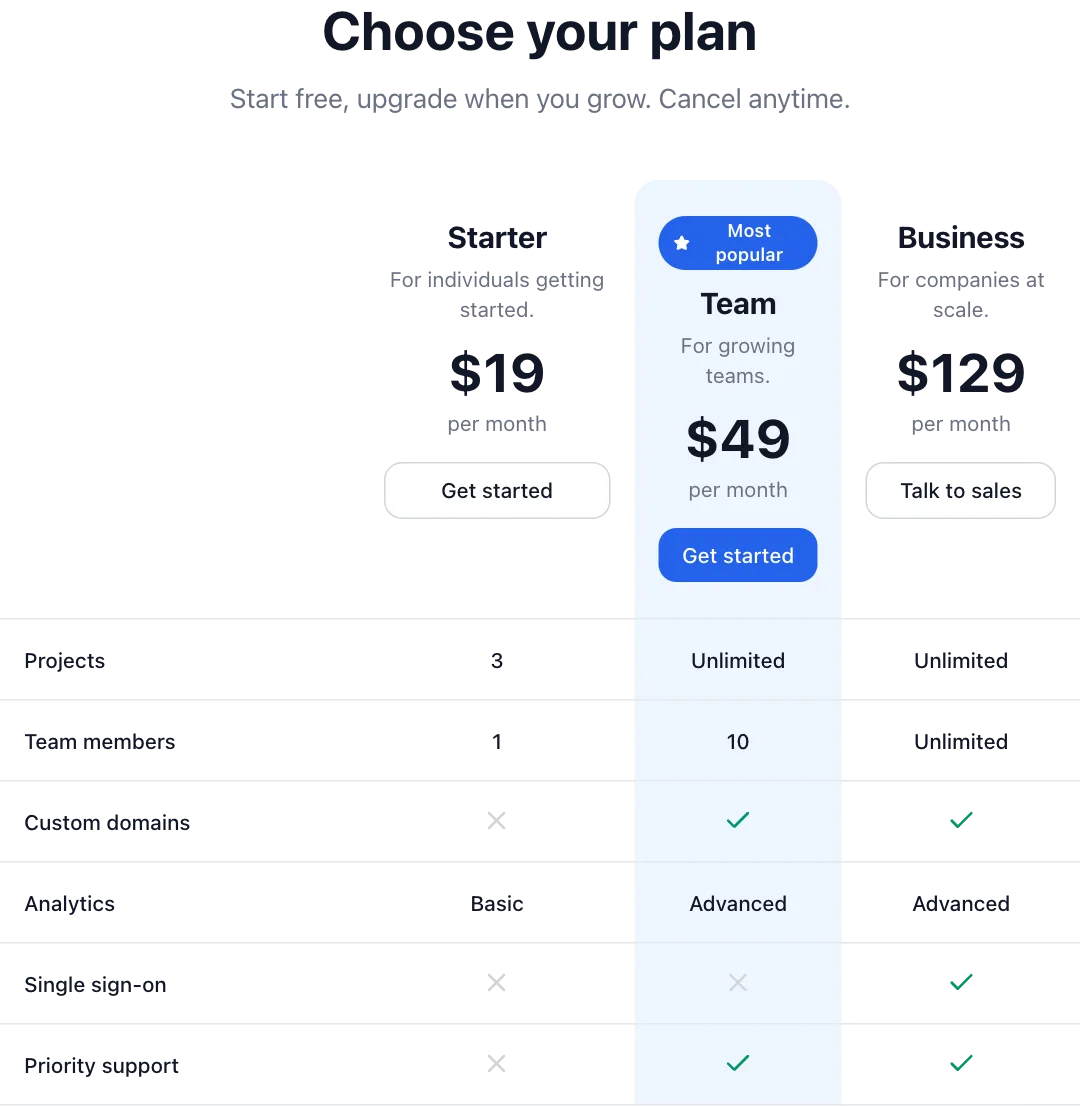 Pricing tablePlans that rise into place, with a highlighted favourite.
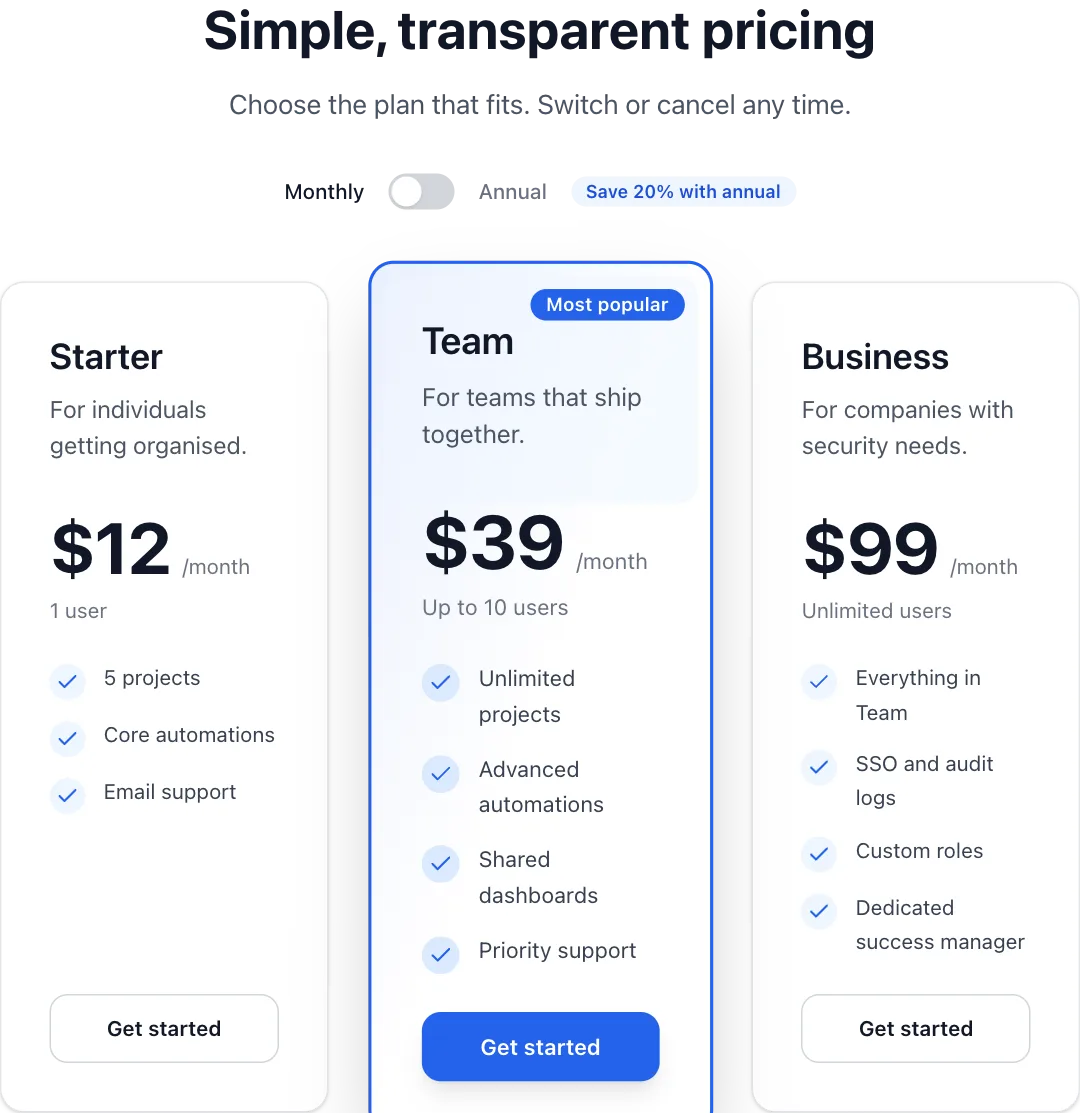 Pricing with billing togglePlan cards with a monthly or annual switch that animates every price.
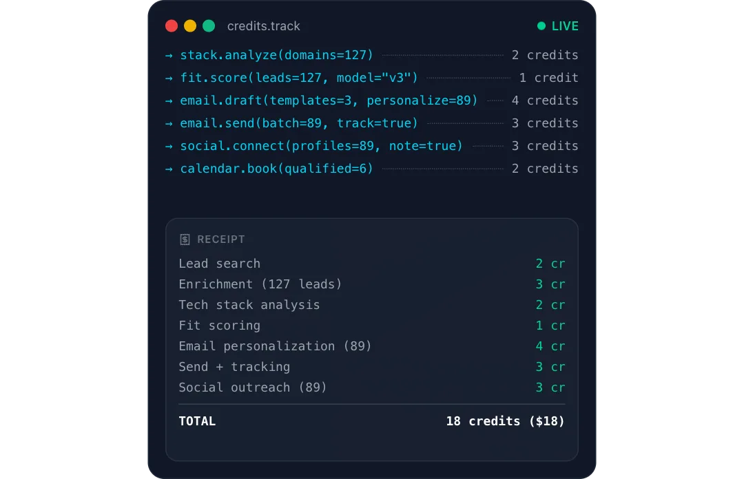 Usage receiptA job runs step by step in a terminal while a receipt prints below it, each line adding its credits to a running total.
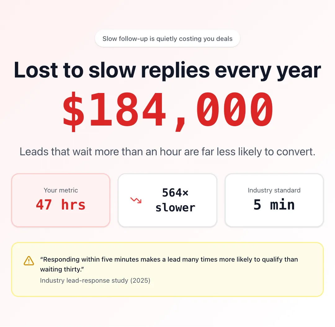 Problem heroA hero that frames the problem with one big number, a gap to benchmark and a research quote.
React + Tailwind CSS. Use downloads in your own sites and products; please don’t resell them as a component library. Repeat downloads of the same component in a month don’t count.