Onboarding story
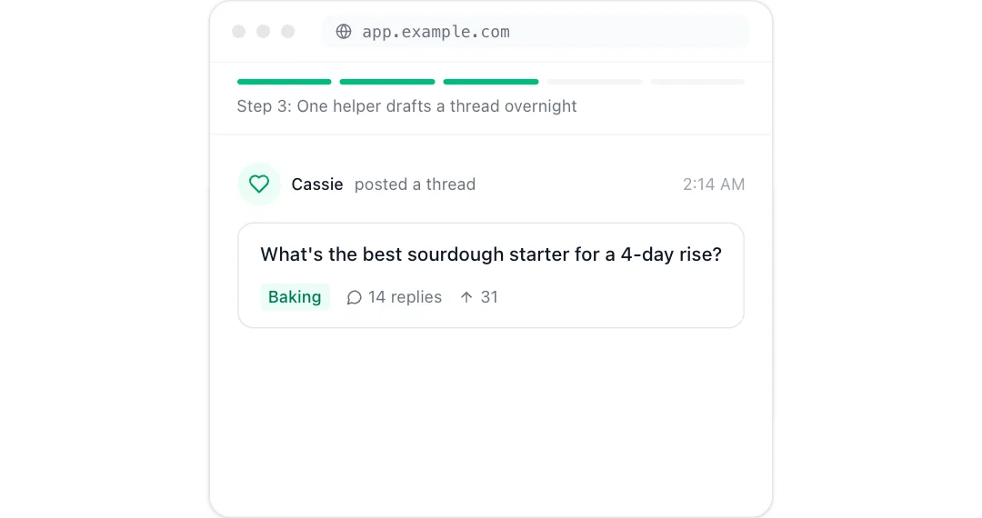
A five-beat product story in a browser frame, from typing in a website to waking up to results.
npm install motion clsx tailwind-merge lucide-react or npx programmable-cli add onboarding-story
MP4 and GIF exports are for sites that are not on React. Each counts as this month’s download of the component.
What it’s for
- Homepage heroes that show the product working
- Feature pages, one flow per section
- Launch posts and changelog entries
How to use it
- Download the file. OnboardingStory.tsx is one self-contained React component. Pick a brand colour above and the file comes in it, where the component has a main colour to replace. Sites not on React can take it as an MP4 or GIF.
- Install what it uses.
npm install motion clsx tailwind-merge lucide-react, with Tailwind CSS set up in your project. - Drop it in.
import { OnboardingStory } from "./OnboardingStory";then render<OnboardingStory />where you want it.
Want it about your product? Make one like it and the studio builds a version with your features, numbers and brand.
Related components
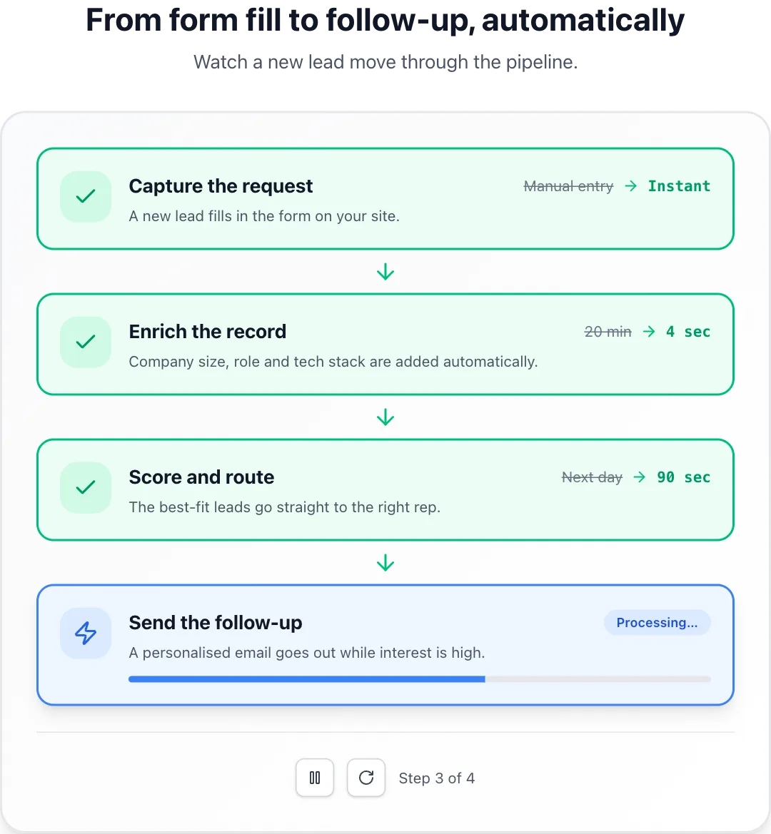 Process walkthroughSteps that complete one after another with a progress bar and before-and-after metrics.
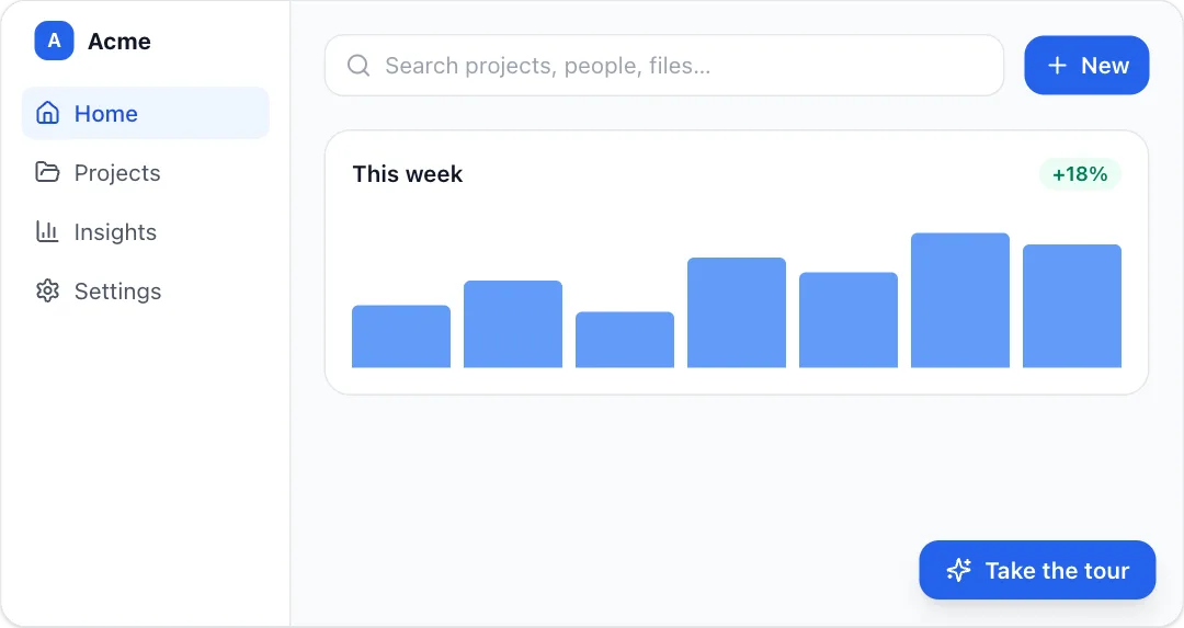 Spotlight tourA guided product tour that dims the page and spotlights each element with a tooltip.
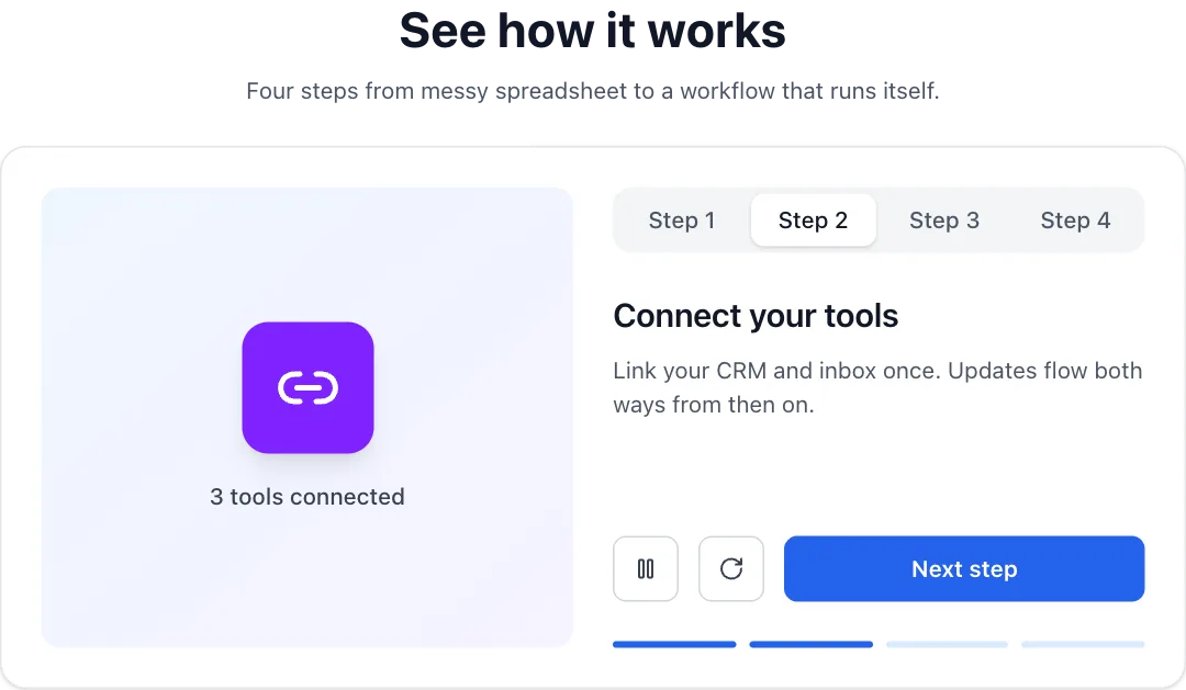 Tabbed demoA step-by-step product demo whose visual swaps per tab and auto-plays through the steps.
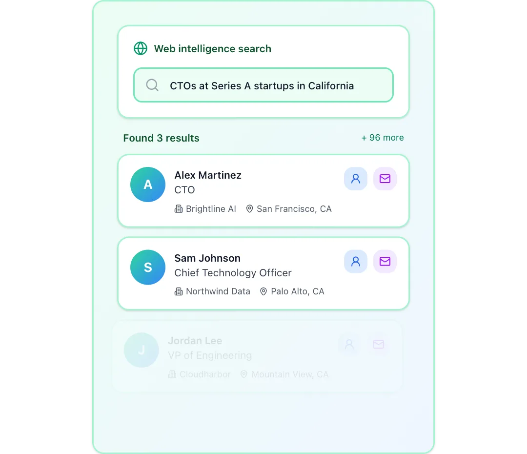 Web intelligence searchA search query types itself, the web is scanned step by step, and matching profiles stream in with a summary.
React + Tailwind CSS. Use downloads in your own sites and products; please don’t resell them as a component library. Repeat downloads of the same component in a month don’t count.